
How to Choose Art for Your Walls: 2026 Room Guide
Mitchell AdelmanTable of Contents
- Start With the Space: How to Choose Art Size for Wall
- How to Arrange Wall Art: Layouts That Actually Work
- Color, Mood, and Making a Room Feel Like You
- Tips for Buying Handmade Art You'll Love for Years
- Rental-Friendly Ways to Hang Art Without Losing Your Deposit
- Keeping Your Art Looking Great: Simple Care Tips
- Conclusion
- Frequently Asked Questions
Last Updated: September 11, 2026
Start With the Space: How to Choose Art Size for Wall
The fastest way to make a room feel finished is to size your art to your wall before you fall in love with a piece. A common mistake is buying art first and figuring out where it goes later. That usually ends with something too small floating above the sofa or something too large crowding the doorway.
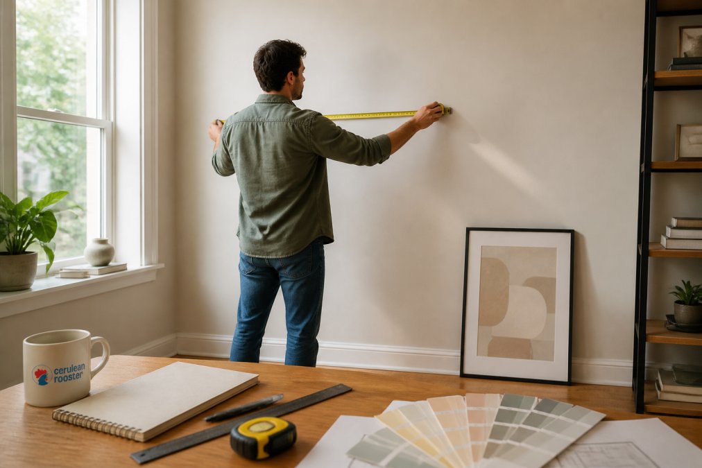
Measure your wall, then measure your furniture. Art should relate to what sits below it, not just to the empty paint around it. A sofa that spans 84 inches calls for art that spans roughly 56 to 70 inches across, whether that's one wide piece or a grouping (thespruce.com). This is where scale and proportion start doing the heavy lifting in a room.
At Cerulean Rooster, we make original watercolors and ink illustrations that work beautifully on their own or in small clusters, so you can build a wall gradually instead of all at once.
The 2/3 Rule and Other Simple Formulas
The 2/3 rule is the easiest guideline for how to choose art size for wall: your art should cover about two-thirds of the width of the furniture beneath it. For a 60-inch console, aim for 40 inches of art. For a king bed, think 60 to 70 inches.
Two more formulas worth keeping in your head:
- Hanging height: center your art at 57 to 60 inches from the floor, the standard eye level for most adults (nga.gov).
- Above furniture: leave 6 to 8 inches of breathing room between the top of a sofa or headboard and the bottom of the frame.
If you're working with a small original like our 7 1/2" x 5 1/2" watercolors, don't hang it alone on a large wall. Group two or three together, or pair it with a larger anchor piece so the composition reads as intentional rather than lost.
How to Arrange Wall Art: Layouts That Actually Work
How to arrange wall art comes down to one question: what should the eye land on first? Every arrangement needs a focal point, and the rest of the wall should support it, not compete with it.
Here's how the three most reliable layouts work in practice:
- Single statement piece: best for a large wall with one clear viewing distance, like above a sofa or at the end of a hallway.
- Grid: identical frames in even rows and columns. Cleanest option for a minimalist room.
- Salon or gallery wall: mixed sizes and shapes, built around one anchor piece with smaller works filling the gaps.
The mistake most people make with a gallery wall is spacing. Keep 2 to 3 inches between frames. Tighter than that feels cramped; wider than 4 inches and the grouping stops reading as one unit.
Gallery Wall Basics for Beginners
Start with a template. Trace each frame onto kraft paper, cut the shapes out, and tape them to the wall. Live with the layout for a day before you commit to hardware. This one step prevents the most common gallery wall regret: a hole in the wrong place.
Then build from the center outward. Place your anchor piece at eye level, add the next largest works around it, and fill the remaining space with smaller pieces. Variety in size and medium keeps a gallery wall from looking like a store display. Mix a watercolor with an ink drawing, or pair a landscape with a portrait.
Color, Mood, and Making a Room Feel Like You
Color is the fastest way to change how a room feels, and art is the fastest way to change color. A muted palette reads calm; saturated reds and oranges wake a space up. If your walls are already busy, choose art that echoes one existing color rather than introducing a new one.
But here's what most guides skip: the subject of a piece shapes a room as much as its palette does. Researchers who study restorative environments, a body of work associated with attention-restoration theory, consistently find that natural imagery (trees, water, open sky) helps people recover focus and lower stress after mental fatigue. That's why a landscape above a desk tends to feel right in a way a bold abstract sometimes doesn't. It's not decoration. It's recovery.
A few patterns worth knowing before you commit a wall:
- Nature and landscape imagery tends to calm and restore. Good for bedrooms, reading corners, and anywhere you need to downshift.
- Abstract work invites the eye to wander without demanding a narrative. It reads as open and modern, and it rarely tires because there's no single "correct" way to look at it.
- Portraiture and figurative work creates a sense of company. A face on the wall makes a room feel inhabited, which is why portraits work in entryways and hallways, where you pass but don't linger.
- Bold graphic or high-contrast pieces raise the energy of a space. Best in kitchens, home gyms, and rooms where you want momentum.
Mood matters more than matching. A piece you love will hold a room together even if it doesn't match the sofa. The reverse is rarely true: art chosen purely to coordinate tends to feel flat within a month.
Think about how you use the room, too. A room where you read and rest benefits from quieter imagery. A hallway or entry can handle something bolder, because nobody lingers there. This is where art stops being decor and starts being personal.
At Cerulean Rooster, this is the whole point of what we make. Our watercolors and ink illustrations are built around a feeling first, a quiet landscape, a portrait of someone you love, a pet rendered in linework that captures their exact expression. We're two deaf brothers, and expressive art is how we communicate. Every commission, card, and sticker is made with the emotion you want the piece to carry, not a color swatch.
Tips for Buying Handmade Art You'll Love for Years
Buying handmade art is different from buying a print off a shelf. You're buying a piece of someone's time, and that changes what you should look for, and how you should care for it once it's yours.
A few things to check before buying:
- Ask about materials. Ink on Bristol paper and watercolor on cotton rag age very differently. A seller who can tell you exactly what they used is a seller who cares about longevity.
- Look at the edges. In a real handmade piece, small variations in line weight and brushwork are a feature, not a flaw.
- Check the story. Who made it, and why? Art with a person behind it tends to stay on your wall longer than art chosen for a trend.
- Ask how it should be framed. The right mat and backing protect the paper underneath. The wrong ones can slowly damage it.
What to Look for in Original vs. Print Art
Original art is a one-of-a-kind piece made by hand, while a print is a reproduction of an existing work. Originals carry texture, variation, and the artist's actual hand; prints offer a lower entry point and easier replacement if a piece gets damaged.
Both have a place. For a first apartment or a rental, prints let you experiment. For a milestone, a gift, or a spot you'll see every day, an original earns its place. Our ink and pen piece *It's Axe Time!* is a good example of an original that holds a wall on its own because the linework gives it visual weight.

If you're buying as a gift, originals also solve the "they already have everything" problem. Nobody regifts a piece that was made once.
How to Protect What You Buy
This is the part most guides skip, and it's the part that decides whether your piece looks the same in ten years.
Light is the biggest threat. Ultraviolet light fades watercolor and ink faster than almost anything else (si.edu). Keep pieces out of direct sun, and if you frame under glass, ask for UV-filtering glazing. Rotating art seasonally spreads the exposure and gives your walls a refresh at the same time.
Humidity and temperature swings do quiet damage. Paper expands and contracts with moisture, which can cause rippling and, over time, foxing, the small brown spots you sometimes see on old prints. Skip the garage, the attic, and the wall directly above a radiator or fireplace. A stable interior wall is always the safer choice.
Dust carefully. Use a soft, dry brush, never a spray cleaner, and never a damp cloth on an unframed piece. Handle by the frame, not the paper, and wash your hands first so oils don't transfer.
Store unframed work flat. Between sheets of acid-free paper, away from damp, and never rolled tight for long periods. Acid-free mat board and a proper backing are what actually preserve an original's value over decades.
At Cerulean Rooster, we make every piece, cards, stickers, people and pet portraits, and full commissions, by hand in our small studio, and we're happy to talk through how to frame and care for what you buy. We're two deaf brothers, and expressive art is our medium. That means the piece you receive was made thoughtfully and packed by hand, and built to last if you treat it well.
Rental-Friendly Ways to Hang Art Without Losing Your Deposit
Renters have more options than they think, and none of them require giving up your security deposit. The trick is matching the hardware to your wall and your weight limit.
| Method | Best For | Wall Damage | Weight Limit |
|---|---|---|---|
| Adhesive strips | Light prints, small originals | None | Light |
| Removable hooks | Medium frames | Minimal | Moderate |
| Picture ledge shelf | Rotating collections | Screw holes | Heavy |
| Traditional nail + hook | Heavy or large pieces | Nail holes | Heavy |
Adhesive strips work well for anything under a couple of pounds, which covers most small watercolors and unframed prints. For heavier pieces, a picture ledge is the renter's secret weapon: it holds real weight, lets you swap art whenever you like, and leaves only a couple of small screw holes that are easy to fill.
One warning: adhesive strips fail on textured walls, fresh paint, and anywhere near heat or steam. Skip them in bathrooms and above radiators, or you'll come home to a frame on the floor.
Keeping Your Art Looking Great: Simple Care Tips
Sunlight is the quiet killer of art. Ultraviolet light fades watercolor faster than almost anything else, so keep pieces out of direct sun or behind glass with UV protection. Rotating art seasonally is a simple way to spread the exposure.
A few habits that keep work looking new:
- Dust with a soft, dry brush. Never spray cleaner onto the surface.
- Handle by the frame, not the paper, and wash your hands first.
- Store unframed pieces flat, between sheets of acid-free paper, away from damp.
- Skip the garage and the attic. Temperature swings do more damage than age does.
Matting and framing matter here too. Acid-free mat board and a proper backing protect the paper underneath, which is what actually preserves the value of an original over decades.
Conclusion
Choosing art for your walls gets much easier once you stop treating it as a decorating decision and start treating it as a personal one. Measure first, arrange on paper, buy pieces that mean something, and take care of them once they're up.
That's the whole idea behind Cerulean Rooster. We're a family-run studio owned by two deaf brothers, and every original piece, sticker, and card is made and packed by hand in our small studio. When you buy from us, you're getting work with a person behind it, not a mass-produced print.
Browse the shop, pick a piece that speaks to you, and give that blank wall something worth looking at.
Frequently Asked Questions
What is the 2/3 rule for wall art?
The 2/3 rule says your art should take up about two-thirds of the width of the furniture below it, like a sofa or console table. For example, if your sofa is 84 inches wide, aim for art that's around 56 inches wide total. This keeps the arrangement balanced and grounded. It's a starting point, not a strict law, but it helps you avoid art that looks too small or too oversized for the space.
How high should wall art be hung?
The general guideline is to hang art so its center sits at 57 to 60 inches from the floor, which is average eye level for most adults. In rooms where people mostly sit, like a dining room or living room, you might go a little lower, around 55 to 58 inches. If you're hanging above furniture, leave 6 to 8 inches between the bottom of the frame and the top of the sofa or table.
Should wall art match your furniture or contrast it?
Neither approach is wrong. Matching creates a calm, cohesive feel, while contrasting adds energy and visual interest. A good middle ground is to pull one or two colors from your existing decor and let the art introduce a new accent. For instance, a neutral room can handle a bold, colorful piece, while a busy room often benefits from quieter art. Trust your gut on what feels right.
How do you choose art for a small space?
In small rooms, scale matters more than quantity. One larger statement piece often works better than several small frames because it reduces visual clutter. If you prefer a gallery wall, keep the frames close together, about 2 to 3 inches apart, so the grouping reads as one unit. Light colors and simple frames help the space feel open rather than crowded.
What is the best way to mix different art styles in one room?
Pick a common thread, like a shared color, frame finish, or subject theme, and let everything else vary. You can mix a watercolor landscape with a bold graphic print if they share a similar palette. Keep the matting and framing consistent to tie things together. Grouping pieces by style in separate zones also works well, so each area feels intentional rather than chaotic.